
Every email marketer has a send they’d like back. The promo code with a typo. The webinar that moved to Thursday. The shipping promise that stopped being true an hour after the campaign went out. Once an email lands, the copy is frozen, and the only fix most of us have is a “Sorry, wrong link” follow-up that gets opened by a fraction of the people who saw the original.
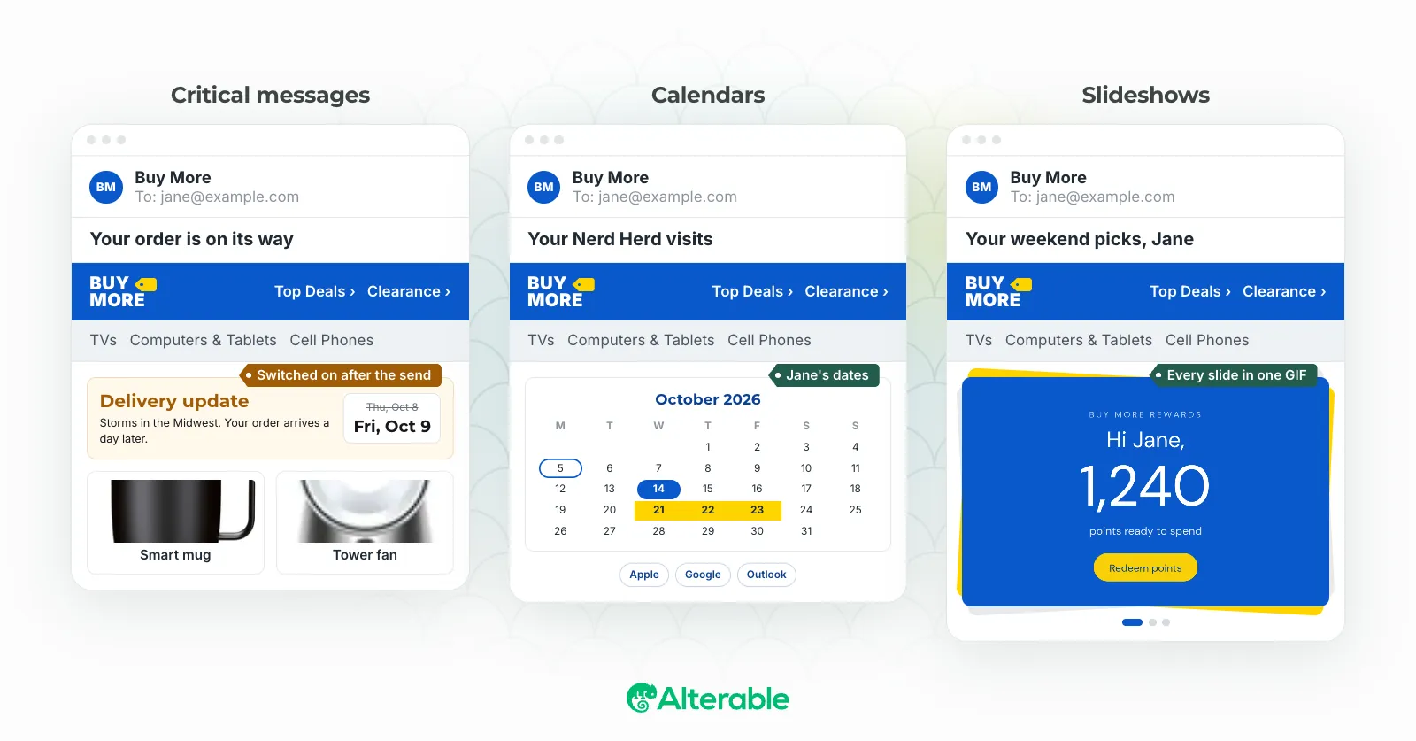
Images are the exception. An image in an email is fetched when it’s opened, which is the whole idea behind Alterable. This release takes that idea in four new directions: a banner you can switch on after the send, a calendar drawn with each reader’s own dates, charts drawn from each reader’s own numbers, and slideshows that fit five pictures in the space of one.
Critical messages: a switch for emails already in inboxes
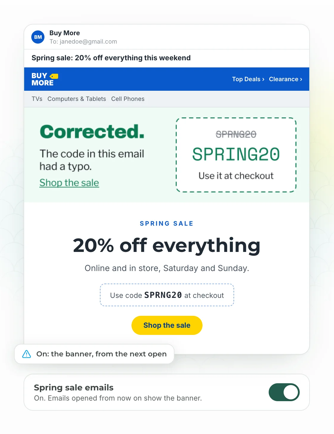
A critical message is a banner you place in your template before you send, and leave switched off. Off, it’s a transparent pixel with no width and no height, so it takes no room and nobody sees it. If something changes after the send, you switch it on in Alterable, and emails opened from then on show the banner.
You start from one of four presets (service outage, shipping delay, event change, offer correction) or a blank 600×200 banner, and design it in the same editor as dynamic images. It always carries a link, so you can add the click URL after the send, when you actually know where people should go.
A few details that matter when you’re the one holding the switch:
- Switching on asks for confirmation, and every member of the team gets an email and an in-app notice saying who switched it. Nobody should learn about an outage banner from a customer.
- Only opens while the message is on count as impressions. A banner waiting in the dark costs nothing.
- You can switch it from the API, the MCP server or Zapier, so a status page or an order system can flip it without anyone logging in.
One honest caveat: a change reaches a reader the next time their email app loads the image, and most emails opened for the first time after you switch get it. Apple Mail can hold on to the copy it already loaded, though, so someone who opened the email before the switch may see the old state for up to a couple of days.
Building critical messages works on every plan, and so does switching them off. Switching one on needs Pro or Scale.
Calendars: each reader’s own dates, in a month view
The image designer has a new layer: a month calendar. Its highlighted dates and ranges usually come from merge tags, so the renewal date, the booking, the class schedule or the delivery window is different for every reader. It reads dates the way ESPs tend to send them (2026-10-14, 10/14/2026, 14/10/2026, Oct 14, 2026, timestamps), and skips a tag your ESP left unfilled instead of drawing a wrong date.
You pick the month (current, next, or the one the dates fall in), the first day of the week, the language, font, colors and how highlighted days are marked: a circle, square, ring, dot, or an icon you upload, so each night of a stay can show a bed. Dates that mean different things can look different: mark the stay one way and the payment deadline another, up to five kinds of date, and turn on the legend to name each one under the calendar. Because the calendar is a layer, it sits in a dynamic image or product with your logo, text and anything else you’d put there.
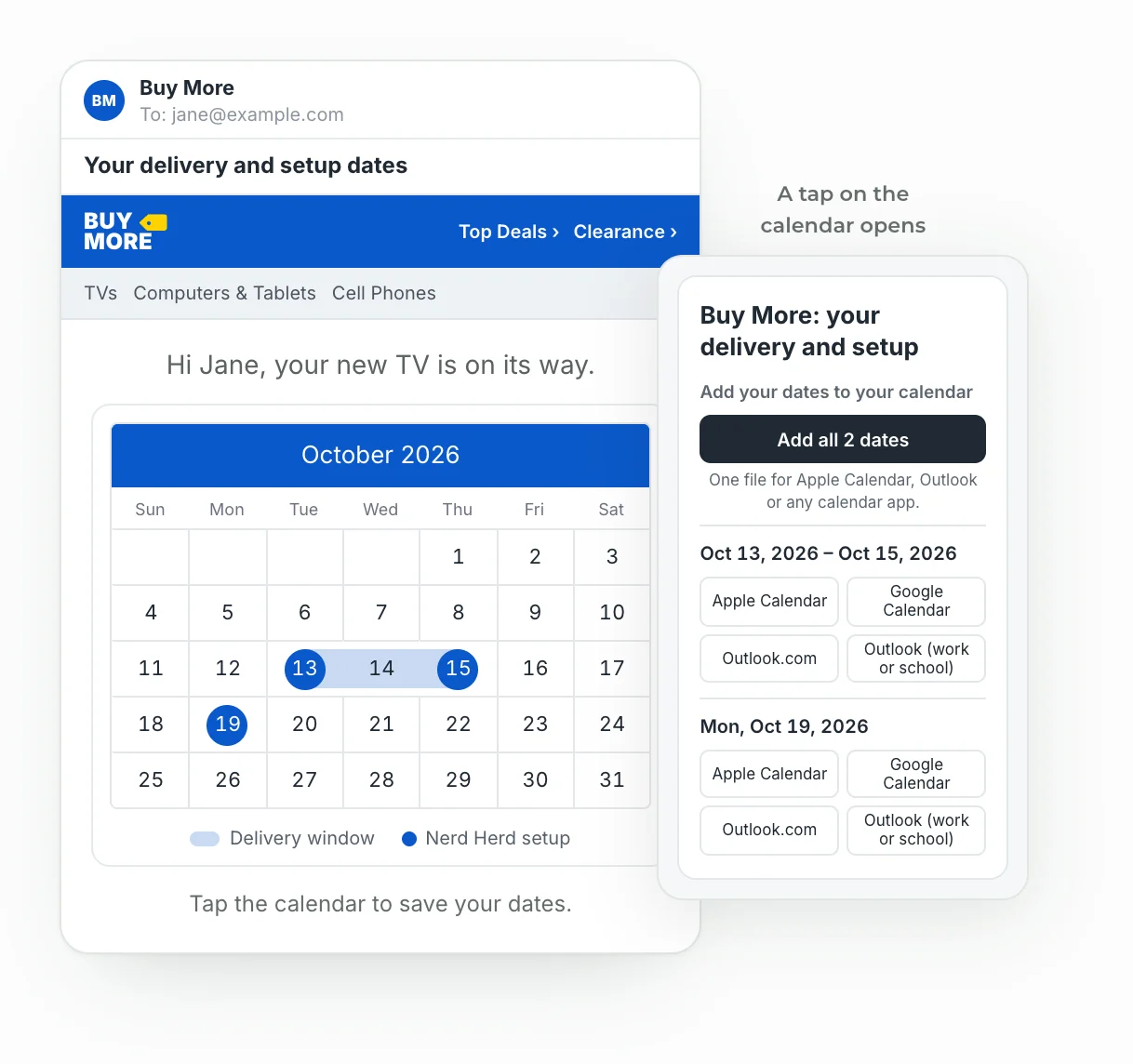
Turn on Add to calendar and a click on the image opens a page with the reader’s dates and buttons for Apple Calendar, Google Calendar, Outlook.com and Outlook for work or school. Several dates go into one file. Dates that have passed aren’t offered.
Countdown timers use the same page. When a timer’s click opens a calendar event, the reader picks their calendar app (Gmail on the web and Android included) and gets an event that lands at the right time.
Charts: each reader’s own numbers, drawn at open
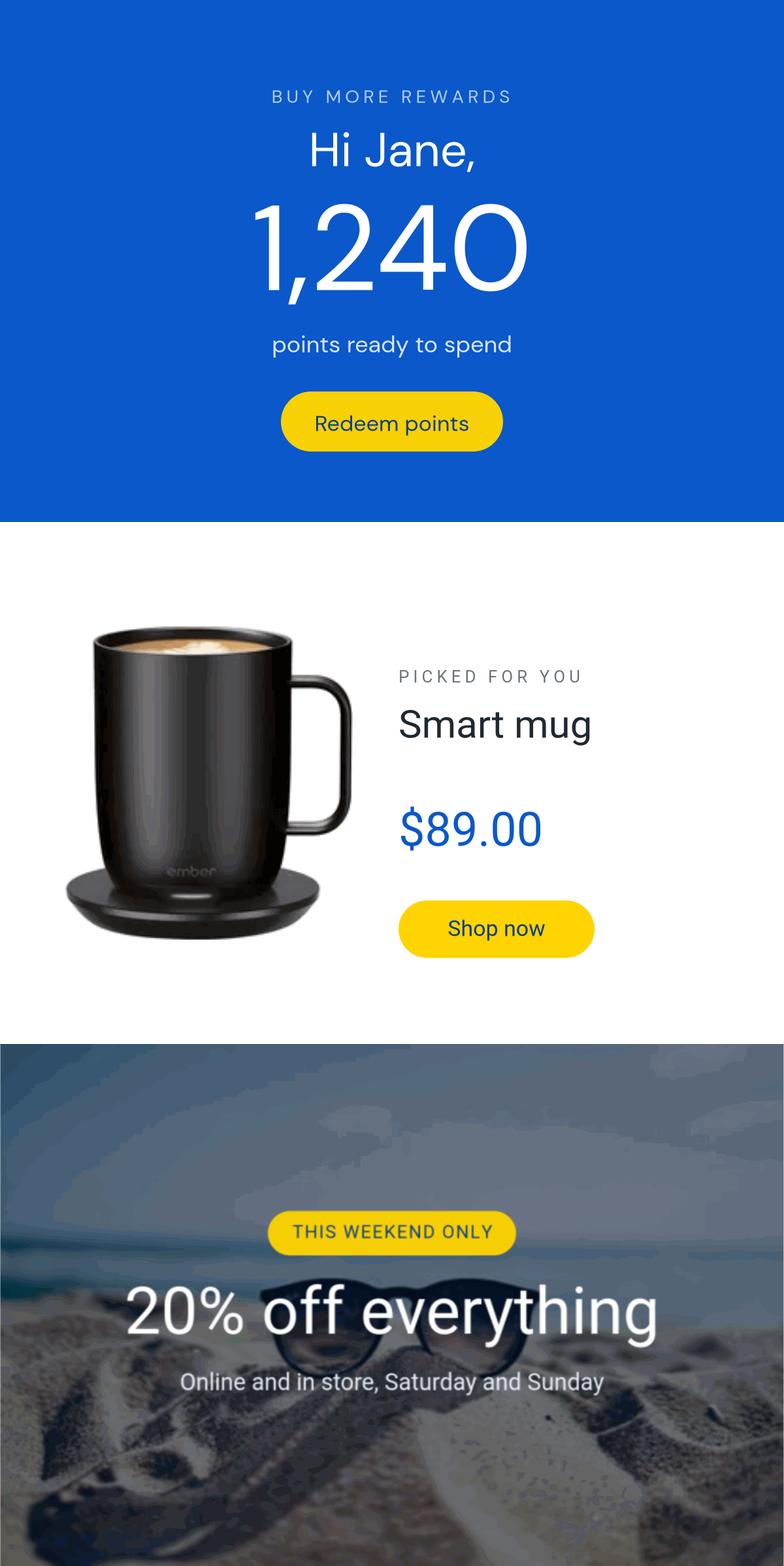
Loyalty emails have a habit of saying “You have 1,240 points” in plain text and leaving the reader to work out what that means. I’ve seen plenty of them. A number on its own rarely tells you how close you are to anything.
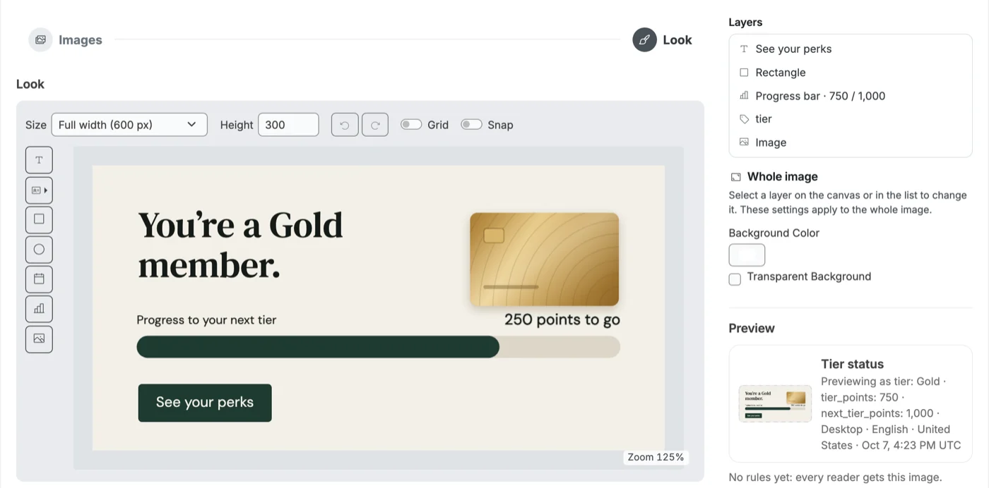
The designer now has a chart layer too. Its numbers usually come from merge tags, so each reader sees their own: points toward the next reward, a fundraising total against its goal, where their money went this year, their activity month by month. There are eight types: a progress bar, a gauge (a full ring or a half), pie, doughnut, bar, column, line and area.
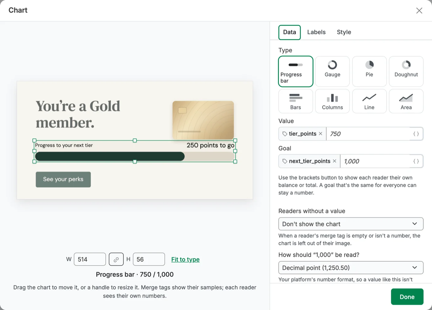
The labels do some of the work. A progress bar or a gauge can show a percentage, the value, the value against the goal, or a sentence of your own, like “{remaining} points to your next reward”, with the gap filled in for each reader. Numbers come through the way ESPs send them (1250, 1,250, $12.99, 45%), and there’s a setting for platforms that write decimals with a comma.
And when a reader’s tag arrives empty? You decide: leave the chart out of their image, draw a fallback value, or draw zero. Nobody should open an email telling them they have 0 points because a field didn’t sync.
Like the calendar, a chart is a layer in a dynamic image or product, and the API and MCP server can set charts too. Two templates in the gallery start you off: Reward progress and Tier status.
Slideshows: five slides, one GIF
A slideshow is one animated GIF that plays two to five slides. A slide can be a library image, a hosted image, a dynamic image or a dynamic product, and each one gets its own timing. You choose to loop or to play a set number of times, and the whole slideshow takes one click URL.
The personalized slides are drawn for each reader at open, like any dynamic image. I’d put the personalized one first: classic Outlook for Windows only shows the first frame of a GIF, and the editor warns you when slide one is static. Static slides work on every plan; dynamic slides, retina and the templates need Pro or Scale.
A designer that forgives mistakes
If you’ve built dynamic images in Alterable, the designer is where you’ll notice the difference first. It has undo and redo (⌘Z and ⇧⌘Z), a layers list where you can pick a layer hidden under another and drag to restack, copy, paste and duplicate (⌘C, ⌘V, ⌘D), and a canvas that zooms to fit your screen. Shrink the image size and your layers scale to fit instead of getting cropped.
The editors around it were rebuilt too. Every create page opens with a grid of starting points (local maps included), the preview stays next to the form, and you can move between steps in any order.
Countdown timers, lighter than ever
The countdown GIFs your subscribers download are smaller than they’ve ever been. Same timer, same look, less to load, so it shows up sooner, especially on a phone with a weak signal.
Survey results that read like a report
The survey results page now counts people, not clicks. Each person’s latest answer stands, and the earlier ones are kept as votes. You get a response rate, the average with its top-two share, answers over time, and a table of who said what with a filter by rating and a CSV export. Click any rating to see who gave it. If your votes carry merge tags (source, campaign, segment), you can compare averages between groups.
And the rest
The header was rebuilt around your team, with a team switcher, a Create menu and help where you’d look for it. We also went through the app for keyboard and screen reader use: labelled fields, focus that lands where it should, 44px controls on phones.
Everything above is live in your account today. If you have a send coming up that could go sideways after it leaves (and most do), a critical message is a two-minute insurance policy. Log in and drop one in the template before you send.


