
We’re halfway through 2026, which makes this a better moment to talk about trends than January ever was. The predictions have stopped being predictions. They’ve shown up in real inboxes, and some of them stuck while others quietly faded. I’ve watched teams treat those January trend lists like a campaign brief, highlighter in hand, counting how many they could cram into a single send. I’ve done it myself. It rarely ends well.
So before we get into the email design trends that are actually holding up in 2026, one thing worth saying upfront: a trend is a pattern, not a to-do list. The useful question isn’t “how many of these can I use?” It’s “what is the inbox asking for right now, and does this help me answer it for my audience?” Meghan Sokolnicki, a principal email designer at Marigold, made that point at Unspam 2026, and it’s the right frame for everything below.
With that in mind, here’s what’s earning its place in the second half of the year.
Accessibility stops being a nice-to-have and becomes the law
Let’s start with the one that isn’t optional anymore. The European Accessibility Act came into force on June 28, 2025, and it applies to any company offering products or services in the EU, not just European ones. Through 2026, enforcement is ramping up as member states build out their auditing. If you send marketing email to anyone in Europe, accessible design is now a compliance question, not a style preference.
Here’s the uncomfortable part. The Email Markup Consortium analyzed more than 409,000 campaigns and found that 99.97% contained accessibility issues rated “serious” or “critical.” Out of all those emails, exactly 28 passed clean, from two brands. That’s not a few stragglers. That’s the whole industry.
The fixes aren’t exotic. Use real, semantic HTML with proper heading order. Write descriptive alt text instead of leaving images blank. Keep your body copy at 14px or larger, choose legible fonts, and check your color contrast. Write link text that says where it goes (“read our accessibility guide”) instead of “click here.” Litmus has a thorough 2026 guide to accessible emails if you want the full checklist. None of this is hard. Most teams just never made it a habit. This is the year to fix that.
Dark mode is the default canvas now, not an edge case
If you’re still designing for a white background and previewing dark mode as an afterthought, you’re designing for a shrinking share of your list. About 35% of measurable email opens now happen in dark mode, up from 28% a year earlier, and for some technical or mobile-first audiences it climbs past 40%. Your subscribers didn’t all choose this. Their phones did by defaulting to dark interfaces system-wide.
The problem is that email clients each apply dark mode their own way: some leave your email untouched, some dim it, and some fully invert your colors. So the same email can look polished in one inbox and broken in the next. I’ve seen a beautiful campaign go out with a crisp white logo that simply vanished against an inverted dark background. Nobody caught it because nobody tested for it.
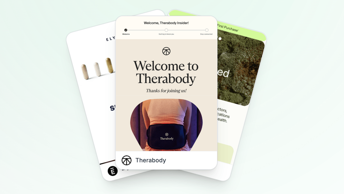
Ketone-IQ: Your Brain on Ketones on Inbox Archive
A few habits go a long way here. Avoid pure black and pure white, which produce the harshest inversions. Use PNG logos with transparent backgrounds, and add a subtle outline so a white mark doesn’t disappear on a light-turned-dark panel. And make dark mode a standard step in your QA, right alongside link checks and mobile previews. Which raises the obvious question: how many of the emails you sent last quarter did you actually open in dark mode before hitting send?
The visual swing: illustration, bold type, and real product photos
For years the default email hero was a polished lifestyle photograph. That’s changing, and I think AI is quietly driving a lot of it.
Illustration is moving into the hero spot. Cartoon-style art, used as the focal point rather than a decorative squiggle, gives brands a way to show personality without looking like everyone else. The same technique lands in wildly different places depending on the brand, which is exactly what makes it useful. Just match the tone to the moment. As Sokolnicki put it, if you’re sending an eviction notice, you probably don’t want a little smiling broom kicking someone out.
Drift: "Refreshing…perfect for summer!" ★★★★★ on Inbox Archive
Bold, editorial typography is having a moment too. A very large display headline paired with small body copy creates real visual tension, and the best part is you can do it with live text. That means no heavy hero image to load, better rendering across clients, and type that screen readers can actually read. (Please don’t undo all of that by exporting your headline as a flat image.) Pair it with the muted earth-tone palettes that have replaced harsh white backgrounds, and you get something that feels calm and intentional.
Then there’s the counter-trend that tells you where the inbox’s head is at: straight product photography. As people grow more aware of AI-generated visuals, a clean, honest photo of the actual product reads as proof. This is real. This is what you’re going to get. In a feed full of synthetic images, that authenticity is becoming its own design choice. Worth noting: those same AI tools are now spitting out earth tones and purple-to-blue gradients by default, so a palette that feels distinctive today could get oversaturated faster than usual. Make the choice deliberately instead of accepting the suggestion.
Lighter, faster, and built in blocks
The other clear direction for 2026 is restraint. Email design is getting lighter and faster, partly for performance and partly because crowded emails just don’t work. When you give a subscriber five things to do, they often do nothing.
That’s why the giant, multi-megabyte GIF is fading and micro-animations are taking its place: small, subtle motion that draws the eye without the load-time penalty. It’s easy to watch that shift across real campaigns: Inbox Archive flags the sends still leaning on animation, so you can compare the heavy-GIF era against the lighter motion brands that are moving toward it.
Elysium Health: Experience Elysium and get 10% off your routine on Inbox Archive
It’s also why modular, card-based layouts keep gaining ground. Instead of rebuilding an email every time, teams assemble it from reusable blocks they can rearrange, swap, and reorder. A grid of nine related recipes reads beautifully. A grid of nine unrelated promotions just creates fatigue. The structure only helps when the content actually belongs together.
Modularity isn’t only a production convenience, though. It’s the foundation for the trend I think matters most.
Personalization moves from the name field to the content itself
Think back to when “personalized email” meant dropping a first name into the subject line. That trick still works a little, but the bar has moved. The real shift for 2026 is personalization at the level of the content blocks themselves, where the modules a subscriber sees are chosen based on what they actually did, not just who they are.
This is where modular design and personalization meet. Once your email is built from blocks, you can swap those blocks based on behavior, location, loyalty status, or what’s in stock at the moment someone opens, rather than the moment you hit send. That last distinction matters more than it sounds. A countdown that’s accurate at open time, an offer that reflects current inventory, and a recommendation based on the last thing someone browsed: these turn a static broadcast into something that feels current and personal.
That open-time, block-level personalization is exactly what we built Alterable to handle, so the right content renders the moment a subscriber opens, not whatever was true when the campaign was queued. If you’re already moving toward modular design this year, real-time personalization is the natural next step to layer on top of it. To see who’s already doing it, Inbox Archive tags campaigns using dynamic, open-time content so you can study live examples instead of demos.
Elysium Health: Don’t miss 15% off Creatine+ on Inbox Archive
None of these trends is a finish line. The principles underneath them are the same ones that always mattered: clear hierarchy, generous white space, and decisions made in service of the person opening the email. A rounded corner won’t save a cluttered layout, and a gradient won’t fix a message that has nothing to say. Pick the trends that help your audience, skip the ones that don’t, and design for the human first. The rest tends to follow.
Alterable helps email marketers add real-time personalized content to their campaigns — countdown timers, dynamic products, location-based images, and more.